Choosing the correct default easing for Popmotion
Choosing default values for a library is difficult. Should you be the benefactor/victim of a wider audience:
- These defaults will be used, often unwittingly, by your consumers.
- You can change them only at the risk of breaking other people’s stuff.
In a motion engine, these choices manifest themselves in a visual and visceral way. A duration here, a spring tightness there.
This means there’s responsibility to choose values intelligently, so that the little patches of the web that use your library benefit from more responsive motion.
As the userbase of Popmotion is relatively small, I’ve always felt comfortable shirking the shackles of API stability until I finally felt like it had arrived at a the Good Place. Apologies to anyone who’s lived that.
Luckily, over the years of wildly oscillating GitHub activity graphs,
there has been one (one) decision that I felt like I got right at the start: Making the tween default easing property easeOut.
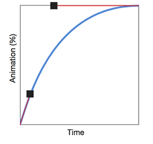 An example of a sweet easeOut, generated with Ceaser @ matthewlein.com/ceaser
A brief history of timing
Like many greying front end devs, my first exposure to UI animation was Greensock’s then-ActionScript library, TweenMax. For a platform so disposed to garish show-off loading screen animations, Flash animations were disgusting to hand code unless you were using TweenMax.
And that’s largely what we used it for: showy animations. The Flash days were as over-the-top and as divorced from the user’s interests as the Amiga demoscene. All you wanted to do was play your cracked version of Worms but first you had to sit through the seizure-inducing cock-prancing of some git in Norwich. At least Flash intros occasionally had a skip button.
 This, but flashing, and scrolling, and waving. Forever
Greensock, in its sunrise years, had the right intentions. It did, and still to this day, has an easeOut as default. That’s because the author understands, despite our hedonism and heathenism, that animation in UI design should be as a result of a user’s action. easeOut is snappy, and as we’ll see later, “snappy” is how we should respond to user actions.
Flash died, and the community collectively denied any involvement.
 "Honestly never heard of it. Like Gordon?"
Then it was all about jQuery. jQuery was incredible for literally everything, which in the new world of composable asynchronous micropackages is probably why we again collectively deny any involvement, and why I’m talking about it in the past tense even while it’s standing right there, watching us.
For me, and maybe for you, the coolest thing about jQuery was animate. It was amazing to easily get something resembling movement in humble HTML. Even if it defaulted to swing easing, a tepid, muddy easeInOut of homeopathic strength.
That easing was coupled with a default duration of 400ms. Then that was folded into our neanderthal, performance-ignorant tweening of the CPU-choking, layout-breaking width and height properties. Lethargic animation ruled the internet.
 Feels like a good idea at the time
The problem with easeInOut
To arrive at an actual point, the problem with easeInOut is that it feels incredibly slow. When we watch videos about the principles of animation, one of the things we’re taught is that objects in motion don’t start in motion and they don’t stop dead.
They start slow, and end slow.
So that sounds about right, we think, and then we stop thinking, and use easeInOut by choice, or a framework like jQuery makes it default, and then everyone uses it, by default, and everything feels sluggish, by default. Why?
Why
Our eyes and brain are hardwired to detect motion. We’ve evolved to find that motion distracting. Motion indicates that the present situation has changed, and we need to react if we’d prefer to survive. We need motion to be distracting.
When you’re scrolling through a website, and a space opens for an advert in the middle of your article, and everything jumps around, and then after a couple of seconds your crap, overpriced “4G” connection finally loads the banner ad, which animates on loop, until you scroll past it, when it then needlessly closes, god I hate Motherboard, your text jumps back up, you think of the poor bastard forced to make it, their hopes, their dreams, their broken dreams - all of those things are distracting.
That motion, the things causing it: They’re not imparting useful information, they’re not even trying to kill you. So it’s annoying.
It’s all shit, the user isn’t involved in any of this, he’s happy about the broken dreams. And yet, easeInOut is entirely appropriate, it is the least damaging easing to use for uninstigated animation, it is the right choice.
What does it say about an easing that this is a good use case for it?
It’s sometimes okay, I guess
A very tiny amount of uninstigated motion is fine in a UI, as long as it correctly indicates that the situation has changed, and the user needs to react. A small “new message” dot, probably. Or a notification panel, possibly.
For this kind of animation, an easeInOut or anticipate is very appropriate because it gives the user a little bit of time to acclimatise to the movement, and it stops quite gently, naturally. It adheres to the principles of animation, these dots and panels now feel a little more real, your UI a little more alive.
It’s certainly better than things just flicking around the page without the user understanding what’s changed.
But usually it very much isn’t
The vast majority of animation in UI is, or should be, user instigated.
For these animations, these interactions, the user already knows that an action has taken place. They started the motion, and the situation has changed, and the UI needs to react. The “in” of an easeIn or easeInOut feels sluggish in this instance because for god’s sake hurry up, get on with it.
The energy and momentum of easeInOut starts in the virtual reality and stays there. The energy and momentum easeOut, conversely, starts in the user’s reality and ends in the interface’s.
It takes the user’s energy, directly from their finger, through the wire or screen, straight into the button, the tooltip, the whatever, and bursts with the maximum energy at that initial moment of contact.
easeInOut is barely bothered to get out of bed, like a stupid stroppy teenager who probably doesn’t even have a finger. Probably.
A user will feel that difference, even if it’s subconscious, even if I have to pretend to myself that deep down they know, just to justify the hours of my life I’ve spent writing (and now writing about) animations.
This is why Greensock comes with easeOut by default. It’s why Anime.js uses a zinger elasticOut. And it’s why Popmotion uses easeOut too.
Whereas, CSS transitions default to the swing-alike ease, which is exactly as bland as it sounds. Worse, the native Web Animations API uses linear easing, which is, frankly, a fucking crime.
 Blood at crime scene. Yawn.
Feel it for yourself
Here’s easeInOut.
Buuuuuuurrrrr. END ME.
Conversely, here’s an easeOut with the Popmotion default of 300ms.
I. Am. Blushing.
Notice that when you press start on these examples, you’re pressing the button yet it’s the ball that’s moving. Even with this physical disconnect, the first example feels like you’re telling the ball to move, and then it moves of its own accord. Whereas the second example, you’re making the ball move, it’s using your energy.
It makes a difference! Users can tell.
It does. It makes a difference.It does.Userscantellitmakesadifferencepleasemakeadifferenceuserscantell