Use Pose in Framer X (WIP)
Framer X beta invites are going out and it’s already possible to use Pose in Framer X prototypes.
It’s early days at the moment so integration isn’t seamless but it’s already possible to add UI events like drag, hover and press.
You can also already use Framer X to test animations by exposing pose logic via the UI.
But there are currently limitations, and we’ll take a look at those, too.
Install Pose
First we need to add Pose to our Framer project.
With our project open in Framer X, go to File > Show Project Folder.
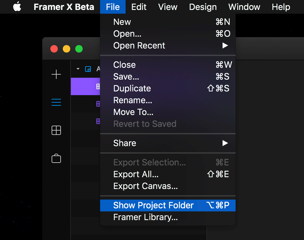 Framer X Show Project
You should have the container folder highlighted. Open this folder in your terminal of choice.
If you’re using VS Code, drag and drop the highlighted folder onto the VS Code dock icon. Then, in VS Code’s file browser, right click in the project root and choose “Open in Terminal”.
This folder is a typical yarn package, so you can add Pose by running yarn add react-pose.
The current limitation with this process is you have to repeat it for every project you want to use Pose in. I’m also unclear as to whether yarn dependencies are saved to the project file itself, as Show Project Folder opens a directory in the app cache.
Create a posed Framer component
At the bottom of the Framer X Component panel, there’s a button labelled “New Component”. Click that, give your component a name, choose “from code” and press “Create and edit”.
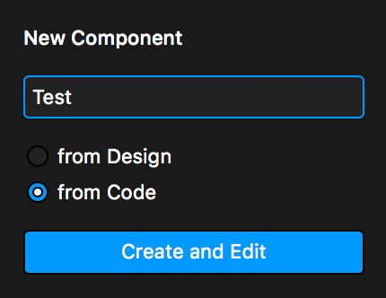 Create a new component
You’ll be greeted with a TypeScript file containing some simple React code.
The only Framer X-specific code in here is a static property called propertyControls, which we’ll explore in a moment.
First, import Pose and make a simple hoverable component:
import posed from 'react-pose';

const Container = posed.div({
  hoverable: true,
  init: { scale: 1 },
  hover: { scale: 1.2 }
});
Replace the render function with the following:
return <Container style={style}>{this.props.text}</Container>;Save, and return to the Framer X editor.
In the components panel you’ll see your new component. You can add this to the Framer X editor by dragging and dropping it in place.
Click the play icon in the top and hover over your new component. It’ll react to your hovering as expected.
 New Framer interactions!
Expose pose controls
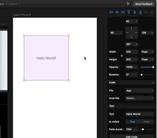
Go back to your editor and highlight your component. Notice in the right-hand inspector there’s a section named after your component with a text input labelled “Text”. If you replace “Hello world!”, your component will update with the input text.
Go to the source code of your component and take a look at the render function. It’s outputting this.props.text.
Now look at propertyControls. It has a single property, text, with a title of “Text”. This is how you expose control over props via the Framer X UI.
We’re going to use this to control Pose animations.
First, -click on propertyControls‘ PropertyControls type. This will take you through to its type definition, and we can take a look at some of the control types available to us.
Let’s use a simple control, a Boolean. Add this to propertyControls:
isVisible: {
  type: ControlType.Boolean,
  title: "Is visible"
}
We also need to add a default for this property to defaultProps:
static defaultProps = {
  text: "Hello World!",
  isVisible: false
};
And a type for the property to the Props interface:
interface Props {
  text: string;
  isVisible: boolean;
}
Now, this control will be available to use in the inspector panel.
But we still need to use this prop in our pose logic. Add two new poses, visible and hidden:
const Container = posed.div({
  hoverable: true,
  init: { scale: 1 },
  hover: { scale: 1.2 },
  visible: { opacity: 1 },
  hidden: { opacity: 0 }
});
And set Container‘s pose prop to either of these poses based the value of isVisible:
<Container
style={style}
pose={this.props.isVisible ? "visible" : "hidden"}
>
{this.props.text}
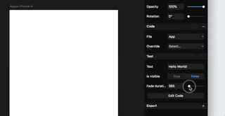
</Container>Now, back in our editor, the “Is visible” toggle control will make our component fade in and out.
Dynamic pose props
We can use the Framer UI to affect the actual transition used, too.
Repeating the steps above, add a new fadeDuration property to the right-hand inspector. This time, we want it to be a Number.
By -clicking PropertyControls again we can see that NumberControl has a max property available which, if we don’t set, the range slider will max out at 100. So lets change that to something higher like 10000:
fadeDuration: {
  type: ControlType.Number,
  max: 10000,
  title: "Fade duration"
}
Then make a new fade transition creator:
const fadeTransition = ({ fadeDuration }) => ({
  type: 'tween',
  duration: fadeDuration
});
And apply this to our visible and hidden poses:
const Container = posed.div({
  hoverable: true,
  init: { scale: 1 },
  hover: { scale: 1.2 },
  visible: {
    opacity: 1,
    transition: fadeTransition
  },
  hidden: {
    opacity: 0,
    transition: fadeTransition
  }
});
Finally, ensure we’re passing the fadeDuration prop to Container:
<Container
  style={style}
  pose={this.props.isVisible ? "visible" : "hidden"}
  fadeDuration={this.props.fadeDuration}
>
  {this.props.text}
</Container>
Now, you can change the duration of the transition with the new “Fade duration” number slider in the inspector panel. Play with the visibility toggle to check it out!
 Close down that feedback loop!
Conclusion
This level of integration is already possible, but in the near future it’d be great to figure out a way of triggering local state/prop changes from other components within the Framer prototype itself.
I’d also like to be able to expose the entire pose API via the Framer UI, as well as figure out PoseGroup integration. Framer will be a great tool for closing down the feedback loop when playing around with interactions.
Some of the above may already be possible, and just requires further exploration. Hit me up if you have any ideas!